Although there are many fonts for posters we cannot choose just any, in most cases we have to think of an alternative according to the standards not only of the message but also of the brand.
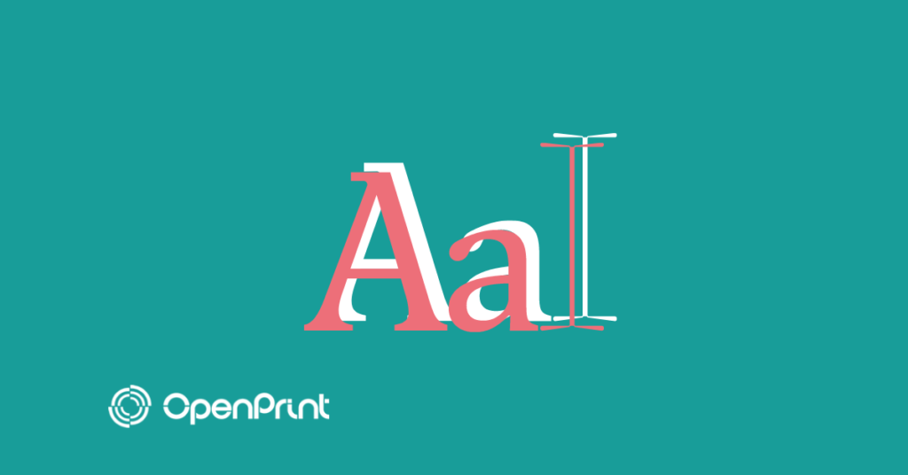
And yes, like the colors, the design, the correct size of the font for its readability together with the phrase itself as such, the typography of the poster represents a high profile. For that reason, in today’s article, we will talk about the best fonts for advertising posters.
Do you want to know which ones are? Then keep reading!
Top 10 fonts for successful posters
We are going to start with the list of the best letters or fonts for advertising posters for different purposes, in this way you will have a clear notion of the most suitable options that you can choose.
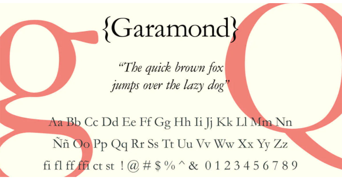
1. Garamond
Garamond is a typeface from the Serifs category that has the peculiarity of having light finishes in the lowercase and uppercase letters, unlike Sans Serif, where a pointed style was chosen at the ends.
In general terms, it is a perfect source for business and academic brands, so I invite you to try it in the layout of your business Posters and Billboard.
>> Get this source by clicking here.
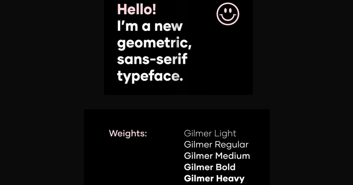
2. Gilmer
Gilmer is undoubtedly an excellent typeface for Custom Billboards related to the world of fashion or to create a minimalist design, basically due to its geometric style of the bold type, which provides an incredible result in the texts.
This font has its own variant called Gilmer Light, keeping the same shape, but with a thinner typeface.
>> Get this source by clicking here.
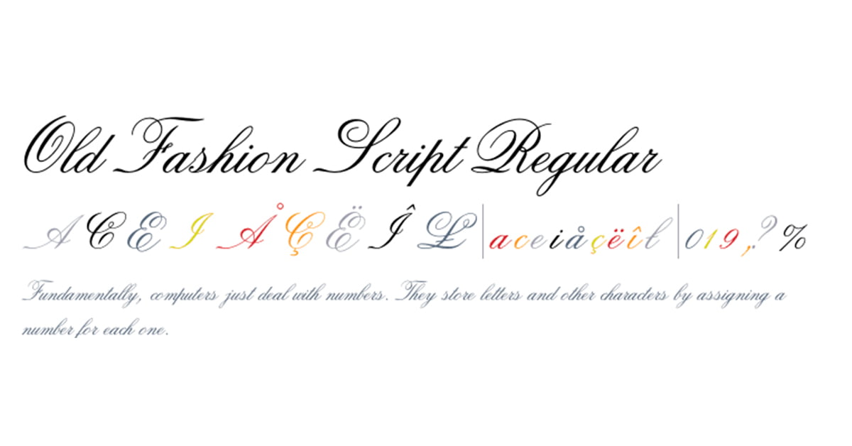
3. Old Fashion Script
Why is this font ideal for speaking to your clients? Practically because it is not the most appropriate if you intend to sell, for that reason, its use is relegated to expression.
Thanks to the replica of an elegant hand stroke, it looks great on advertising posters related to tourism, travel, and even food. However, you can always do your tests regardless of the sector or the market.
>> Get this source by clicking here.
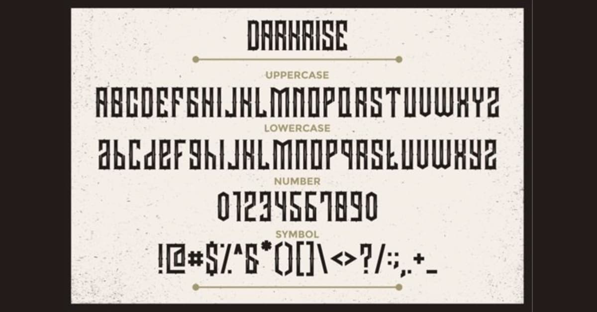
4. Darkrise
Gothic typography is characterized by its thick vertical and horizontal strokes, as for its use, it would be recommended in dramatic messages.
Here you have to have a bit of common sense and know in what theme to use it, because it does not look good in a service company, but it does in Luminous Signs for a costume brand, logos, promotional shirts or merchandising.
>> Get this source by clicking here.
5. Aleo
For its part, the Aleo typeface is designed to achieve a design more inclined to the conventional poster with the possibility of combining them with its other versions in Italic, BoldItalic, LightItalic, Regular, Light and Bold.
Likewise, it is not an aggressive advertising font due to its rounded shape, guaranteeing great legibility in titles and informal Poster texts.
>> Get this source by clicking here.
6. Coldiac
If you have a brand or business dedicated to the world of elegance and luxury such as the sale of perfumes, jewelry, etc. The Coldiac font is definitely what you are looking for, just look at its thin lines that convey a lot of class.
With this option you will achieve the necessary balance to stand out with your Custom Posters, of course, do not think to write with this font because its use falls only on the titles due to the lack of lowercase letters.
>> Get this source by clicking here.
7. Originals
Looking for a brush typeface style? Originals is a cool hand-drawn typeface that encompasses uppercase, lowercase, and numbers. In principle, it does not have a specific use, offering us the opportunity to use it for different purposes.
However, due to the type of typography, it is perfect for summer themes to print custom clothing of the season, cards, posters, and A3 Posters.
>> Get this source by clicking here.
8. ITC Avant Garde Gothic
It is one of the oldest poster fonts in the item, debuting in the 1970s by designers Herb Luballin and Tom Carnase.
Since then some 50 years have passed, to this day it is still an excellent alternative for designers who seek a modern air in their advertising such as the Advertising Mupis.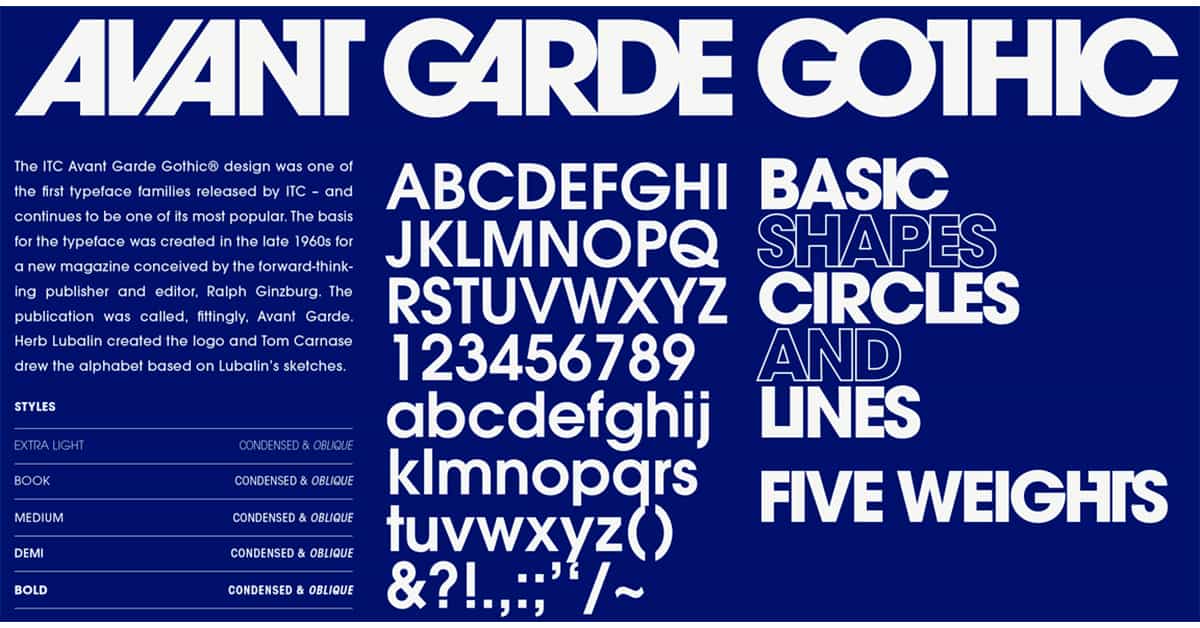
>> Get this source by clicking here.
9. Lavandería
The history of this font is curious because the creator tells us that his inspiration came from looking at the windows of laundry, and adding a unique touch resulted in a calligraphy typeface.
Because it is a large and elegant font at the same time, we do not recommend it for texts but for titles, it looks great in advertisements in the hotel and food sector as well as in restaurants.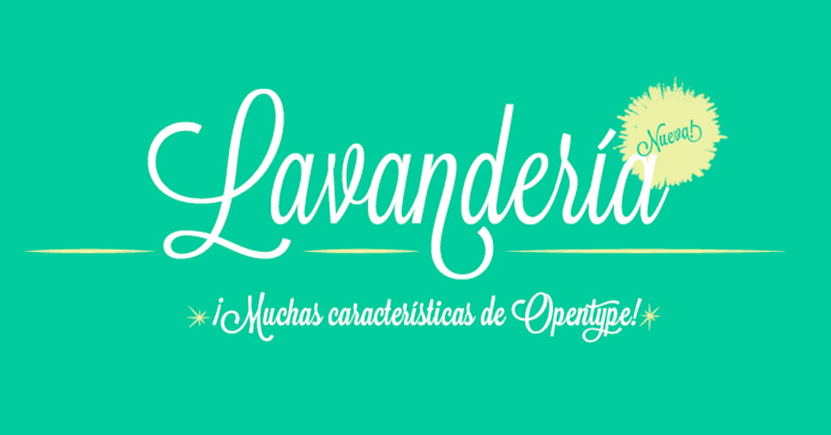
>> Get this source by clicking here.
10. Arjenta Black
Arjenta Black belongs to the same font style as Laundry, the difference lies in thicker lines and ends, making it perfect for professional purposes in creative design work.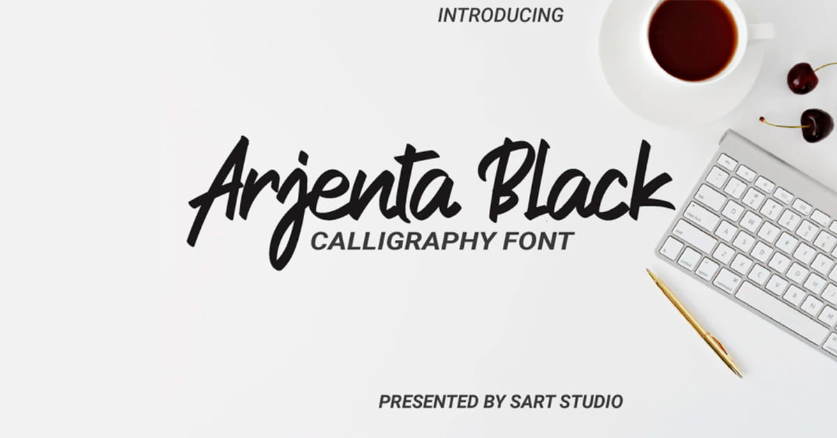
>> Get this source by clicking here.
Tips for choosing the best typography to design posters
It is important when designing your ads that the fonts for your posters follow a series of guidelines to achieve the objective set, that is, that it is eye-catching and attracts customers.
As a base point, we know that the different letters for posters determine a tone of voice consistent with a brand purpose or reflection of it.
It is not only about choosing the first one that we like, but we must expand our possibilities while we carry out an analysis of the different sources available.
In this way, by choosing the correct typeface or font, we will not create confusion for readers because of a bad preference. It is also important not to abuse the amount of text incorporated in the poster to avoid a risk of negative distraction.
Well, this point being clarified, let’s see a list of professional tips if you want to have the most appropriate typeface for your advertisement or advertising poster.
Readable
Make sure you choose a font that is easy to read, enough to grab your audience’s attention without causing confusion. Do not choose fonts with strange shapes that make it difficult to understand what the sign says with the naked eye.
Simple
Simple letters should be used that do not distract the reader. Surely you remember the many minimalist typefaces seen on billboards, and that’s the point, creating a memorable design for the public.
Font size
The font of your poster should not be too big or too small, remember to keep a balanced setting according to the dimensions of the ad. The idea is to use a little text well highlighted to facilitate its reading.
Font colors
A text is legible when it has a color that contrasts perfectly with the background and other colors of the poster, if you are going to use a dark palette for the letters, choose a light palette as the background and vice versa.
According to the message to be transmitted
As we mentioned before, the fonts have to be aligned with the message that you are going to transmit without forgetting what your business or brand is like.
For example, if your firm is dedicated to the sale of perfumes, the most logical thing would be to opt for a Coldiac font or even Arjenta Black, but not for a Darkrise because it does not make sense.
Conclusion
Typographic fonts are not all the same despite having certain similarities between one and the other. Each one speaks for itself, with a different tone of voice and style. Therefore, it is essential that you investigate among all the alternatives and thus choose the ideal typeface for your advertising posters.
Contact OpenPrint, specialists in graphic printing, if after designing your poster you need high-quality and durable printing. In addition, you have at your disposal in our online printing store to choose the most suitable type of support for your business.
Share it at your Social Networks
You may also like...
No Comments in What are the best fonts for advertising posters?
Sorry, comments are closed...