
Surely thousands of times you have heard of pantone colors and on some occasion you have seen its characteristic color palette, but do you really know what pantone colors are and what they are for? If the answer is no, don’t worry, in this article we tell you everything you want to know and more.
At Openprint, as a specialized printer, we usually receive questions from our customers about pantone colors, how to find yours and its applications. We want to help you, that is why we have decided to create this publication.
What are Pantone colors?
Pantone is an American company that created the PMS (Pantone Matching System) which consists of identifying colors by means of a code made up of numbers and letters.
Its origin dates back to 1963 when Lawrence Herbert saw the need to select a code for each color and thus improve communication between artists, architects, designers, printers … Currently there are the famous Pantone guides (Pantone color chart) where they are all the colors created by the brand with their respective code and formula to obtain them.
Not all people have the same perception of a color and depending on the material, lighting or even the environment, their appreciation may be affected. To date, the Pantone 2020 system has defined 1867 colors and as the years go by, this number is increasing.
How to use the pantone color chart?
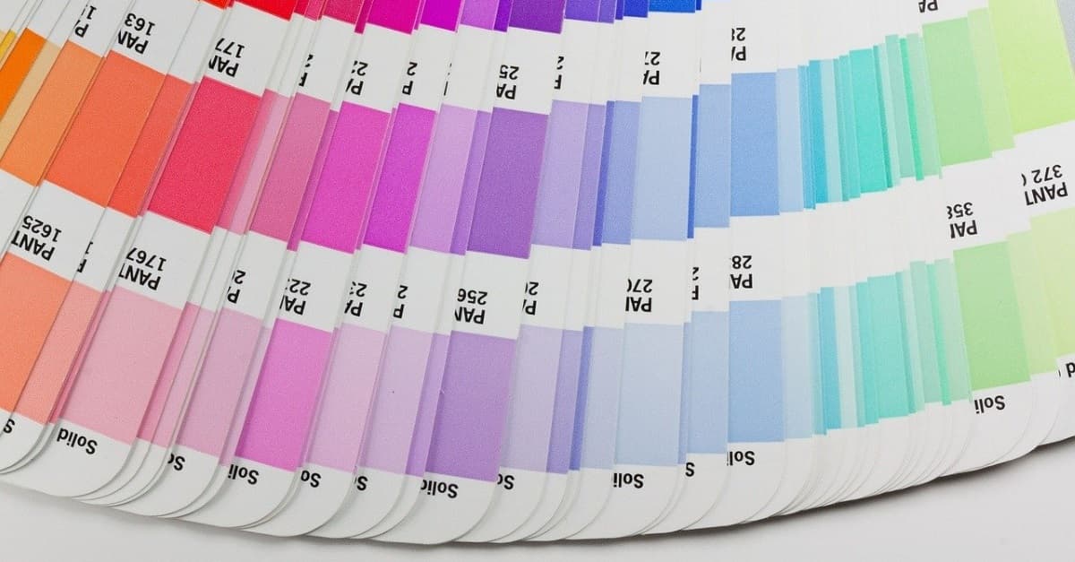
The company has created its pantone color charts to facilitate color identification. They are made up of all the colors created to date including their pantone code and the equivalence to CMYK, HTML and RGB values for digital design.
There is no single guide that contains all the colors. There are six types of Pantone color charts depending on the type of paper where it is printed or the finish of the ink, since depending on the type of support you use, the color is displayed differently.
Solid: It is the most popular guide selection, since they are the colors that everyone knows. It is made up of 1,500 different tones. Only Pantone colors and their specific code are present.
Color Bridge: It is the most practical guide since Pantone colors and their equivalents in CMYK appear, so you can easily see the difference between the two.
Pastel & Neons: 156 Pastel colors and 56 special neon colors for marketing and signage products.
Metallic: Only colors with a metallic finish are displayed. There are two kinds; Pantone Metallics, which shows the most basic and traditional colors and Pantone Premium Metallics, which is more sophisticated.
Uses and applications of Pantone colors
Pantone colors manage to unify the language of colors between customers and suppliers or service companies, such as printers. They accurately specify an applied color using the inks directly compared to other CMYK systems that use basic color composition.
They are also very oriented to the graphic industry. They are the day to day of graphic designers since they are the perfect tool to choose a color in a design studio and know how to obtain it correctly.
They have become the perfect guide to ensure that your brand image follows the same tone and the same line. So your clients can easily identify your corporate color without confusion. Get all your corporate elements, such as the logo, packaging, vehicles … stand out in the same way.
Many well-known companies have already carried out campaigns or projects in collaboration with the Pantone brand highlighting the importance of colors in our lives.
- Zara launched a collection partnering with Pantone to create seven exclusive colors of comfortable and sustainable garments.

- The Pantone company created a unique green color for the Lacoste brand. The FOREVERGREEN color, a vibrant shade of green created in homage to the lush green environment found in the Everglades.

How to know the Pantone code of a color?
If you need to know what Pantone color the logo of your company or business uses, there are different ways to find out. At OpenPrint we offer you a series of solutions to your problem and we explain it to you in the easiest way possible.
How do I know what Pantone color my logo is in Illustrator?
If you have the Adobe Illustrator tool on your computer, knowing the Pantone color will be very simple. You just have to follow these 4 steps:
- You will first need to open the selected logo or EPS file in Illustrator.
- Then select with the mouse the section of the logo where the color you are looking for is located.
- Click on the window and inside Color and samples.
- A window will open with the color box where it will tell you the reference of the Pantone color.
How to know what Pantone color is my logo on their website?
Another very simple option to find out which Pantone color your logo has is to go directly to the Pantone website and enter the Find a Pantone Color option. Once inside, on the left side you just have to click on Adjust and select the RGB / CMYK / HEX option. All you have to do is enter the code of your color in the desired color space and you will get the equivalence.
How to explain to OpenPrint the colors chosen for the prints of your project?
As we have explained before, the Pantone system works directly with the use of inks, so in the world of printing the coding of Pantone colors only works for offset printing.
If the project you want to do is possible to do with Offset technology, you just have to tell us the Pantone number of your color and Open Print will take care of the rest. If, on the other hand, your company wants to carry out projects with digital printing, you must first find the equivalence in the CMYK system, with the help of the Pantone guides or on their website, and let us know so that we can carry out the work.
Share it at your Social Networks
You may also like...
No Comments in What are pantone colors and how to use them in your projects?
Sorry, comments are closed...